


Have you ever set out to create a flower arrangement, only to wonder why the end product was not as you had envisioned? Are you curious about making an attractive floral arrangement that brightens up your space indoors?
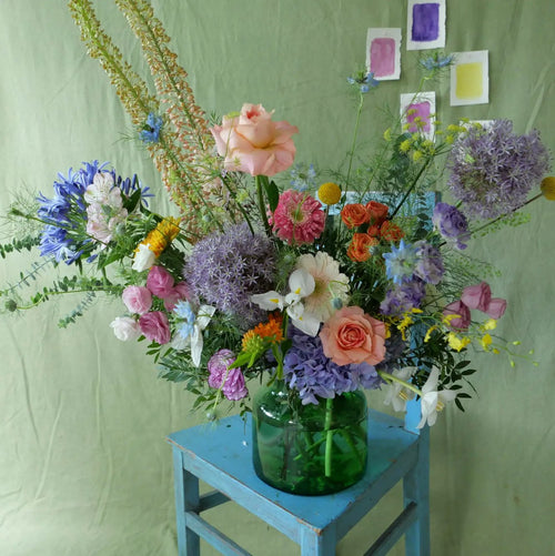
The color wheel is a trick to making a beautiful floral design - florists use this strategy by referring to the color wheel for arrangements when creating palettes. With the color palette as a guide, you will not have to play guesswork or go through too much trial-and-error to find out if specific colours mix well together.
Everyone loves flower arrangements for their beautiful colours, shapes, and presentation. However, deciding on a cohesive color palette can be daunting.
Attending a flower workshop in Singapore with a florist gives you a hands-on opportunity to put this technique to practice. Still, if you plan on practicing at home, there are several tips and tricks, so do read on to find out more.
Monochromatic
A bouquet of fresh blooms consisting of one colour is the epitome of the phrase, “less is more”. This color palette allows the attention to be drawn towards a particular block of color, making it a true statement piece and the main focus in any room.
With this color palette of choice, it presents an opportunity to play with texture since you can put aside the worry of contrasting colours. Remember that one colour can contain various shades.
Complementary
Several bold and striking floral arrangements count on taking a primary colour, such as red, yellow or blue, and their complement as the main colours for the flower arrangement.
You can check out the colour wheel tool and try pairing complementary colours.
Examples include red and green, purple and yellow, and blue and orange. These pairs help brighten the other color for the biggest visual impact.
Pastels
Soft pastel colours are a safe bet - blush, pink, peach, and creams are oftentimes flower industry staples when it comes to shopping for a palette. Pastel shades emphasise on the petal texture, bring softness, and inspire a feeling of sweetness and romance.
For a natural and cohesive feel in the bouquet, try tossing in some pale greens, yellows, and lavender.
Ombre
This color palette of choice is related to both colour and arrangement (or, you can think about it as the floral placement). Picking one colour and arranging flowers in a way such that it transitions from lighter to darker shades, will always have an aesthetically pleasant effect.
You can start with one colour and slowly switch to another, with some blooms bridging between the two.
Silver greens and dark greens
If you plan on incorporating foliage, keep in mind that a bright green bloom will introduce warmth and lightness.
Like fern, dark green foliage creates a moodier and earthy effect, while silver greens like eucalyptus create a calmer tone.
Conclusion
By understanding how the colour wheel works and applying it to your floral selections, you can make a variety of floral arrangements that are tailored to your preferences.
Whether you plan on making a flower arrangement as a gift or for decking out the home, it is handy to know the basics of flower arrangement and the practice of self-care with floral arrangements.
Here at Charlotte Puxley Flowers, we offer a wide range of flower services. From floral subscriptions to flower bouquet workshops, you will find something that suits your needs. We also offer exquisite flowers delivery in Singapore, ensuring your loved ones receive stunning floral arrangements for any occasion.
0 comments